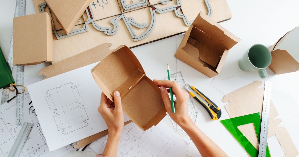
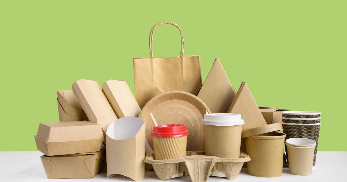
Packaging protects your products, but it’s also doing a lot of work to communicate with shoppers in the store. Competing for shopper attention on store shelves is tough, but sticking to your brand and employing some eye-catching design elements can help grab your shopper’s attention.
From your message to your art to the material used in your packaging, you have the opportunity to stand out on store shelves to just the right customers and shoppers. Keep reading to see how:
Know Your Customers & Your Shoppers
If you’re trying to catch the attention of buyers in the store from your packaging alone, you need to know your customers and shoppers. Not every person who adds your items to their cart is the final user, and you may need to do some convincing to the shopper.
A simple example of this type of messaging is promoting the health benefits of a children’s snack food for the parent to consider. But there’s always a chance the person buying your product isn’t the person using it, so understanding your ideal customer’s potential relationships can help develop a packaging design and message to connect with the shopper and the end user.
Thoughtful Packaging Communication
What does the shopper need to know about your brand and your product? There isn’t much space on the average package or product to communicate everything, and lots of text can make the design busy and overwhelming. When choosing the messaging on your packaging, especially on the front, consider how you’ll communicate your value proposition and what consumers need to know. For example:
- What’s the one thing that makes your product stand out, like an active ingredient?
- What’s a value of your brand that connects with your customer, like the bang for their buck or any commitments to causes?
- Has your formulation, branding, or size of the product changed lately?
- Is the product new or a limited edition?
Thoughtful communication goes beyond the words you use. You communicate values and information about your brand through design elements and even the materials you use for packaging.
There’s plenty of psychology behind colors, shapes, weight, and texture. When you think about how a luxury product is boxed, like a smartphone or designer piece of jewelry, what do you imagine the box to feel like? Matte and smooth, maybe with glossy embossed highlights? How does the box feel in your hands, perhaps somewhat heavier than you expect? The quality of the product is communicated through the packaging.
On the other hand, if you’re looking for more eco-conscious products, what might that packaging feel like? You might expect tighter packaging without extra fluff, a rough texture that would indicate the use of recycled materials, and minimalist ink usage.
If you can’t express the value of your brand and product completely in words — consider how the packaging can do the work for you.

Design Elements to Consider
Need some ideas to brainstorm your perfect packaging? Here’s what we’re seeing:
Embrace Technology
Shoppers have their smartphones out in the store, whether they’re using a list app, searching for coupons, or researching products as they browse. Leverage that technology with a QR code on your packaging. Using these easy-to-scan codes, you can create a unique customer experience before they ever make the purchase. The code could direct to a coupon, reviews, ingredient information, a contest, or even a mini-game to entice customers.
The QR code is easy to recognize at a glance, and shoppers scanning shelves will quickly register what the code is among a sea of products. They know they can get more information from that code and may be persuaded to pick up the product to learn more.
Do a Throwback
Packaging and branding evolve over time, but if there’s one thing consumers love — it’s a good throwback. Reimagine the packaging design of your brand’s past. New to the game? Nostalgia marketing can also apply to relatively new brands. Embrace the style of older labeling, like a font, color palette, artwork, or even writing style. What did the past packaging in your industry look like, and how can you put your brand’s twist on it?
With movements to embrace vintage style and thrift certain items to reduce consumption, consumers recognize and assign value to popular design elements of the past, which could draw them to your product with this strategy.
Go Green
If you haven’t already, incorporate greener practices into your packaging. Far beyond rough, undyed, recycled cardboard, sustainable packaging elements include things like:
- Smaller packaging to reduce material usage
- Water-based or vegetable-based inks that easily wash off without polluting the environment
- Reusable or refillable containers
- Easily recycled materials, like paper products or aluminum
Consumers are looking for more ways to embrace sustainability and reduce environmental impact, and they’re looking for brands that do the same. Many retailers also search for eco-minded brands, meaning greener packaging is essential for building retailer relationships.
Seeing a refill pack next to the original product on shelves might drive customers to more deeply consider your brand, especially if the refills offer potential savings. Communicating that the product is the same size in smaller packaging shows a commitment to improvement and reduced waste.
Catching consumer attention is only the first step, but it’s certainly an important one. Remember, consumers are looking for an experience, and preferably one that aligns with their values. Use your packaging to sample that experience and create a connection with the customer. These trends will also likely increase as younger generations gain more buying power!
Need some help creating an excellent packaging experience? Browse our portfolio of retail packaging for a sample of what you can create with Bay Cities:


/BC_Logo2_White.png?width=300&height=83&name=BC_Logo2_White.png)